

What I Wish I Could Say
Natalie Fong
Embroidery (Wool on Linen Canvas)
89cm x 134cm
March 2017
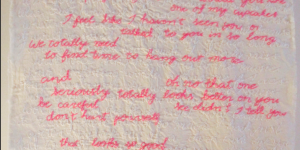
What I Wish I Could Say plays on the idea that there is a difference between what we say and what we think or what we wish we could say. The embroidered pink text shows dialogue that I use, whereas the white text behind that blends in with the canvas are my actual thoughts and the things that I want to say. The colour pink and the act of embroidery refers to the traditions in how society believes girls should act or speak, whereas the white embroidered text portrays pure thoughts and unfiltered emotions.
This was the last project I completed in the IBDP, and has shown how multiple of my skills have grown throughout the years:
• Creativity: I wanted to be able to create a piece that was able to use text in a non-traditional way (as many of my pieces contained elements of text), and it took a while to be able to come up with a concept like this; it is simple with the overlapping of different coloured text, however, I find that sometimes over-complicating ideas (which is easy to do) are not as effective.
• Patience & Time Management: this was a pretty large piece with a lot of embroidery in a short period of time. It took a lot of patience to be able to not only fill the entire canvas with white embroidered text, but add the second layer of pink. It took at least 50+ hours to complete.
• Communication: the piece, although is filled with text, required me to be able to communicate the intent of my work without always being there to explain it to my audience. Through the contrast between the two colours, the audience's eyes should naturally be drawn to the pink, only to notice the subtlety of the cream text underneath, much like how someone may read into the subtext of someone's dialogue.
• Detail Orientation: it took a lot of attention to detail in order to embroider each letter quickly yet still accurately stitching the shapes of each letter so they are legible.

This piece helped me to really understand how sometimes keeping it simple (words on a blank canvas) can let the message of the piece shine, instead of trying to create shapes and silhouettes and complicated imagery. This is something that I will be taking away and be able to apply when communicating and displaying different aspects of my work.